
Friday, March 22, 2013
Kyle S Song Upload
Hi everyone, here's the digital form of my spiderweb. I put another youtube link to the song underneath for maximum juxtaposition!

Thursday, March 21, 2013
Type Designer - Manning
Due to my love of almost any Bauhaus style design, I chose to write about a Bauhaus artist, Herbert Bayer. Bayer technically only designed one typeface throughout his career, but he was also a huge influence in the United States on other artists and type designers, as well as on the world of graphic design and typography at large.
With the Bauhaus School of Design in Weimar, Germany marking a new era of art and design, Herbert Bayer, as one of the school's primary directors, drastically influenced and impacted modern standards of design principles through his successful exploration of imaginative artistic forms and practices, of which the interplay of primary and secondary colors, contrast, basic geometric forms, and photography were key.
Herbert Bayer was born in Haag, Austria on the April 5th, 1900. Early on his life, Bayer took to the world of design. He studied at age nineteen in the office of the architect and designer Georg Schmidthammer in the city of Linz. By the age of twenty-one, Bayer was employed as the assistant to the architect Josef Emmanuel Margol in the artists' colony in Darmstadt, Germany (Strasser, 41). This extensive exposure to the field of architecture enabled a thorough and holistic understanding and appreciation for the basic fundamental forms of design, in which color, geometry, and materials all warrant discussion.
By the year 1921, Bayer had started his studies at the Bauhaus School of Design in Weimar, Germany. The Bauhaus was founded by the German architect, Walter Gropius, in 1919, running until its forced close by the Third Reich in 1933. The literal definition of Bauhaus is “house of construction,” but was known commonly as the “School of Building” (Dickerman, 15). This German arts school was established in the Weimar Republic as an interdisciplinary institution of sorts – one that brought a new identity to modern production of arts, crafts, and furniture. As Leah Dickerman writes, “the Bauhaus brought together artists, architects, and designers in a kind of cultural think tank for the times” (Dickerman, 15). This multifunctional school and space employed a “teaching as experience” methodological approach to education, in which the classroom experience doubled as an exploratory and experimental space for art and design. Gropius strategically placed “workshops” at the center of its curriculum in his April 1919 manifesto, allowing for a multi-pedagogical and progressive educational platform (Dickerman, 15).
Bayer's Bauhaus career was launched as a student, where he took a preliminary course run by Johannes Itten, the visual artist known for his methods of color theory and basic principles of geometry. Itten, as he appreciated the “simple,” employed artistic approaches that made use of basic geometric forms such as the circle, square, and triangle, as well as primary colors (Strasser, 23). Undoubtedly, as revealed by Bayer's later works, this interplay of color and form was of great influence to the young artist. Using his former exposure to architecture, Bayer would begin experimenting with how Bauhaus teachings of form, color, and materials related to the constructed environment around them.
In March of 1922, Herbert Bayer entered the wall-painting workshop, where he would remain active through 1925 (Strasser, 43). Although he had succeeded as a student in other regards, it was here that Bayer would make a name for himself. Ironically, this workshop served initially as an expedient for him, as there were not yet workshops offered in his initial interests, printing or typography (Strasser, 23). Fortunately for Bayer, this workshop would open up a promising future of design.
The workshop was originally facilitated by Oskar Schlemmer, but in 1922, Wassily Kandinsky, the famous German-Expressionist painter from Russia, replaced him. Kandinsky, largely concerned with the “various powers possessed by color,” wanted to include a wide-range of theoretical and practical tasks in his workshops (Strasser, 41). Apart from the chemical and physical qualities of color, Kandinsky was also interested in the psychological qualities, in the way color can alter a form, and create a new form our of another (Strasser, 41). Kandinsky developed a questionnaire for his studentsin which red, yellow, and blue were to be assigned to a triangle, a square or a circle – one color per shape (Strasser, 41). What stemmed from this exercise, when applied practically upon stairwell walls, was Bayer's realization of a theory of color, which would inform all his future work, and largely shape his influence.
As Strasser writes, “It was Herbert Bayer who made a direct translation of such experiments and research into the relationship of color and form” (Strasser, 41). In the summer of 1923, there was a great Bauhaus Exhibition. In preparation, many of Bayer's peers dedicated themselves to the vestibule and the main stairwell, Bayer took on the task of painting the landing of the side stairwell (Strasser, 41). What would result was the principal performer of the stairwell pieces at the exhibit, which puts into practice Kandinsky's analyses of color and form as large-format wall paintings. This large and abstract configuration of geometric basic forms in primary colors illustrated Kandinsky's ideas of exemplary fashion, but more so set a new standard for the way in which the intersection of form and color can be practically applied – particularly as it guides architecture and gives movement to designed spaces.
Although the work of Bayer would be destroyed by the Thuringian National Socialist government in 1930, remains were found in 1970, later fully reconstructed by Werner Claus in 1975 and 1976 (Strasser, 41). Today this represents one of the most succinct realizations of Kandinsky's teaching on color and form, as well as the start of Bayer's successful and highly influential career. By 1925, Bayer was himself appointed as the director of the newly set-up department of printing and advertising. After the Bauhaus' close, he would continue freelance work in graphics in Germany, after which several migrations around the United States brought continued recognition (Strasser, 41). Today, Bayer is marked as a “master” of form and color.
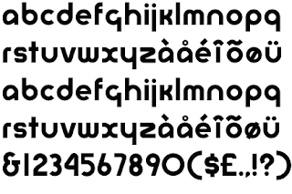
He went on to design the "Universal," also known as "Bayer PS (Post Script)" in his later career, inspired by the Bauhaus style (as evident by the "Bauhaus" typeface), but employing its own unique style. The interesting thing about Universal as a typeface is that it only has a few capital letters. Bayer was a fan of all lowercase typefaces, and he believed they were the necessary way of the future for the world of design. He practiced this ideology in the implementation of his typographic design.

Universal, by Herbert Bayer
Sources used:
Bergdoll, Barry, and Leah Dickerman. Bauhaus 1919-1933: Workshops for Modernity.
New York: Museum of Modern Art, 2009.
Strasser, Josef. 50 Bauhaus Icons You Should Know. Munich: Prestel, 2009.

Cait Stone: Artists Essay
Alex Trochut is a commercial type designer who creates
beautifully complicated images with type for clients such as: British Airways,
Absolute, and Coca-Cola. Born in Barcelona in 1981 Trochut studies graphic
design s Elisave University before beginning his freelance career in 2007. Trochut seems to take the anti-minimalist
approach in regards to his work creating complex images with color and type. It
is clearly evident when viewing his work that this is an artist that is ever
evolving to new styles while determining his unique attributes.
Though not all of his work used type as a focal point, those
that do are stunningly complex yet simply. I particularly enjoy his work with
musical artists from Vampire Weekend to Wiz Khalifa where he designs the
typeface for the promotional materials. Trochut uses delicate script and for
Vampire Weekend he uses stylized images he has created to form the font.
Another very interesting image he creates was for the Audi Billboard Campaign.
With this image Alex created a script font that resembles a road. This image is
very clean and effective in not only demonstrating the nature of the brand but
creating a stunning image. As a public relations professional I tend to skew
towards commercial rather than studio artists.
Some themes that Trochut that are evident when one looks as
all of his work as a whole is the contrast between modern and old. This is
clearly evident when you compare his work with Wiz or Audi with its clean
lettering with his work with The Decemberists and Vampire Weekend’s bubbly hand
drawn images. I very much enjoy all of his work due to its breath of topics and
styles.


Garcia- Type Designer
For this type designer entry I
decided to take a look at Max Miedinger. Miedinger is a Swiss typeface
designer. He is most famous for creating one my favorite typefaces, Helvetica. This
was originally known as Neus Haas Grotesk. Miedinger trained as an apprentice typesetter in
a book printing office. At the age of
26, he became a Typographer in the advertising studio of the Globus department
store chain. In 1956 he became a freelance Graphic Artist in Zurich. In 1957 he created Neue Haas Grotesk. He was
commissioned by Edouard Hoffman, a director of the Hass Type Foundry to develop
a new serif typeface. Miedinger is also known for designing: Pro Arte,
Horizontal, Swiss 921, Swiss 721, Monospace 821 and Miedinger. Max Miedinger
passed away in 1980.
The
reason I chose this type designer is because his design for Neus Haas Grotesk,
now known as Helvetica. This typeface is known for its clean neutral and
legible design. It’s now used in corporate logos, advertising, print and public
signs. Companies that use Helvetica for their corporate logo include:
Crate&Barrel, BMW, Jeep, America Airlines, Toyota, and Evian water. Many
famous designers use it as a main choice, such as Massimo Vignelli. There is
even an entire film named after it. I believe that Miedinger’s type design was
crucial in the progression in typeface design, more specifically for modernist design.

Subscribe to:
Posts (Atom)