I chose the fonts Bauhaus
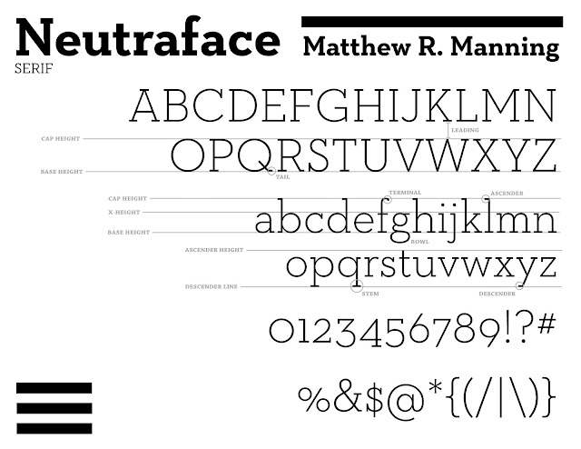
and Neutraface because they are reflective of some of the comparative
analyses we have studied in my Art History major. What
interested me about these two fonts was how vastly different they
were, despite their relative relation in time and culture. Both
Bauhaus and Neutraface are modern fonts, yet they reflect vastly
different aesthetics. The obvious is their variance in serif
type, with Bauhaus being a Sans Serif font and Neutraface being a
Serif font.
The reason I chose these
fonts is because they reflect a similar time in history, while also
demonstrating different values in art culture, as brought upon by
different parts of the world. The Bauhaus font originates from the
Bauhaus School of Design of Weimar, Germany. The Bauhaus is
historically original and internationally renown for their unique
forms and the way they pushed the world of design in a new direction.
Specifically, they employed a method of simplicity in form, also
using color, nature, and other basic elements and forms to simplify
the world of art. The Bauhaus helped establish the world of mass
produced art, though it was still highly relevant, elegant, and
mostly limited to the upper bourgeois classes. Some of the greats in
modern art taught in the school before it's collapse in the Third
Reich. However, despite it's early fall, the Bauhaus forever
revolutionized the way art is created and viewed in a modern lens.
They pushed the limits of simplified modern forms, as this font
demonstrates.
Neautraface on the other
hand, reveals a much more standard form of modernism. Although I do
not know the specific history, this font clearly brings about a
modern look through its foundation in geometry, cleanliness, and
heaviness. Neutraface's numerical values also demonstrate well how
this font employs modern techniques to typography. For me, the
comparison was a natural fit. Same era and time (even part of the
same culture), yet vastly different styles and approaches.


No comments:
Post a Comment