Thursday, February 7, 2013
Cotton-Ch 7
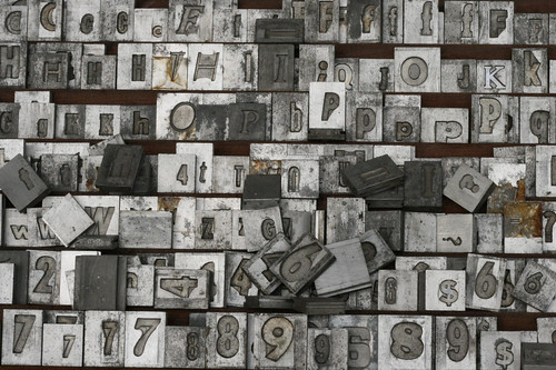
Typography has come a long way from its start in moveable type in 1450. Simple yet beautiful type was capable of being made with moveable type but there were many hurdles that had to be over come. It wasn't as simple as just going through adobe illustrator and picking 6 different types until you finally found the one you wanted, the font had to have been decided long before the piece that was being created was even made. There were limited amounts of font due to having to own each letter in each font type in lead, and this doesn't even account for the multiply font sizes that you would need to purchase on top of that. A great advancement in type occurred when the Linotype Machine was created in 1886. This was the first machine to line up type automatically as well as use a circulating matrix so as to place the type in the correct order itself. The monotype was also a huge advancement in the world of type in the year 1887, just one year after the Linotype Machine. Many advancements have taken place during the turn of the century making type more easily accesible to the mass public as well as professionals. Such advances like Display Phototypesetting in the 1960s helped in allowing typists to play with type spacing which had never been capable until this point, as well as enlarge and shrink font. Another bonus is that phototype had an unlimited amount of characters unlike metal type. As font has moved into the digital age the transition has been seamless. Many programs such as Illustrator have allowed for an array of advancements in how font can be used and the types of font that can be created so as to be used in such software. Many of the things that we use type for today were only dreamed of in the past, this post for example would have taken a typist hours upon hours to create back in 1450, of course I wouldn't expect anyone to want to type a paragraph in moveable type.
Subscribe to:
Post Comments (Atom)
No comments:
Post a Comment